Great cinematography is one of the key ingredients to making a superb film.
One of the first things any filmmaker thinks about when they start a project is what it's ultimately going to look like. What kinds of colors and textures are you going to use? What angles, lighting, and lenses are going to serve your story the best?
To a beginner, those thoughts might be overwhelming as they bang around in your brain, especially if you don't know much about aesthetics and basic conventions of cinematography.
In this video, In Depth Cine offers a great primer on cinematography by exploring Lulu Wang’s The Farewell, namely how Wang and DP Anna Franquesa-Solano overcame visual challenges, used visuals to create subtext, and ultimately portrayed the organized chaos of Billi and the rest of her clan.
Check it out below:
Rule of Thirds
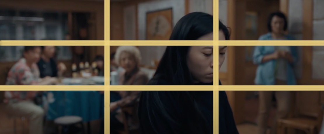
To understand how shots are framed, we have to understand the established "rules" and compositional concepts. The Farewell doesn’t stray away from tradition when it comes to composing a shot. Franquesa-Solano often used the classic Rule of Thirds when shooting Wang’s sophomore feature. This "rule" essentially breaks a frame down into nine parts with two equally spaced vertical and horizontal lines where important subjects in the shot are meant to be placed.
For example, in the film, individual characters or other points of interest are often placed along these invisible vertical or horizontal lines or where these lines intersect.

Leading Lines
Another compositional concept used in this film is leading lines. This is where we see straight lines, usually at an angle, lead our eyes to a central focal point. Oftentimes, the lines point to someone that is entering the frame.
Negative Space
Another cinematographic convention used in The Farewell is negative space. Negative space is categorized as the space surrounding a subject. Many scenes in The Farewell put the subjects against intricate backgrounds full of vibrant colors and different textures. This method gives the audience’s eyes something to focus on while also offering visual rest. (How kind of them!)
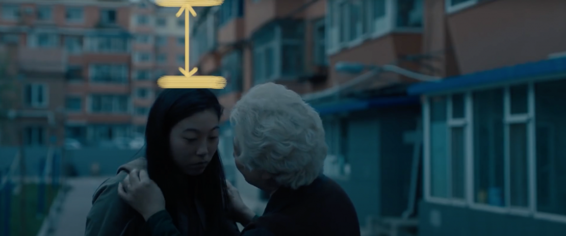
Because so many shots in the film offer a balance of negative and positive space, it creates a psychological sensation of stability. On the flip side, when there is too much negative space above a subject’s head, known as “headroom,” it can create a sense of unease. Different amounts of “nose room" can also alter the viewer’s emotional state.
For example, when a person has a lot of room in front of them, it can be seen as “breathing room.” This puts viewers at ease. The opposite is much more suffocating—facing a person toward the edge of a frame, giving almost no breathing room at all.
Keep in mind, these compositional “rules” are not set in stone; they are merely guidelines that are frequently used in visual art. Certain rules are used more often, while some can be completely disregarded by a cinematographer. It really is all up to the artist to decide what goes, and up to the eye of the beholder to decide what is beautiful.
In The Farewell, the visual language was informed by the story, and that is perhaps the most important lesson you can learn as a budding filmmaker or DP. Cinematographers and directors work to create the most profound visuals possible, but the most profound of them work to take the audience deeper into the narrative, deeper into the minds of the characters, and deeper into their own personal emotional experience.

Your Comment