Jayse Hansen did screen UI design for Top Gun: Maverick and speaks to us about his creative process working on the film.
This post was written by Michelle Gallina and originally appeared on Adobe blog on Sept. 22, 2022.
Top Gun: Maverick, the long-awaited sequel to the classic 1986 Top Gun, premiered in May 2022, to the excitement of fans worldwide. The film follows Pete “Maverick” Mitchell as he fulfills his last assignment in the U.S. Navy to return to the Fighter Weapons School, TOPGUN, and train recent graduates for an urgent mission. Nostalgic scenes of Tom Cruise back in a fighter jet, combined with incredible aerial photography and an iconic beach football scene with Miles Teller and Glen Powell, makes Top Gun: Maverick a spectacularly entertaining film.
Jayse Hansen, who did screen UI design for the film, speaks to us about his creative process working on Top Gun: Maverick, including collaborating with Lockheed Martin to design and animate realistic hero screens to aid in the intense, drama-filled storytelling. He also shares why he chose to design in Illustrator and animate in After Effects—read on below to learn more!
What is “FUI Design,” and what drew you to this specialty?
FUI is a term that stands for Futuristic or Film User Interface design. It’s a niche in the VFX industry for designing and animating advanced computer screens, HUDs (Heads Up Displays) and holograms that heroes or villains use in feature films. I was drawn to it because I love film, design, and future technology, and I love the infinite combinations of art and technology that are possible with it.

How did you start on Top Gun: Maverick?
I’d had some fighter-jet design experience while designing HUDs and holograms for films like Iron Man, Avengers, and Hunger Games. Because of those, I was also fortunate enough to work on real world next-gen military projects that are similar. I think this is why Nicholas Lopardo gave me a call out of the blue one day. We had the dream squadron on this, led and built by visual design director Admiral Bradley “Gmunk” Munkowitz who collected our wingmen together: Sergeant David “Dlew” Lewandowski, who led the animation on my team, wingman designer Nicolas Lopardo, and crewmates, designer Toros Kose, and motion designer James Heredia.
What was it like to design with Lockheed Martin?
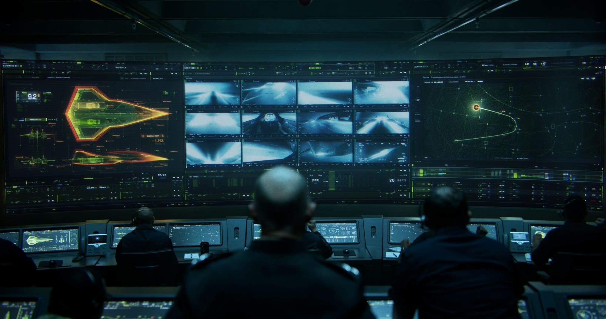
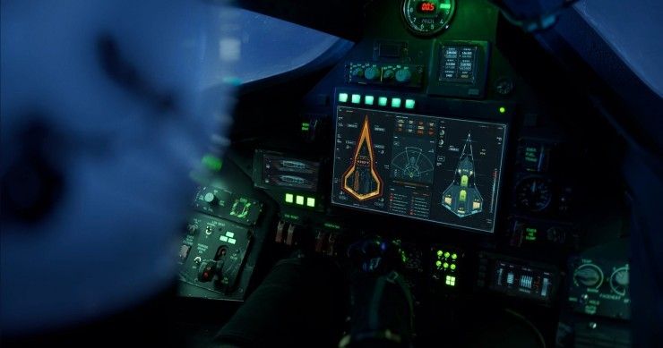
I learned so much working almost daily with Skunkworks and Lockheed. They provided the foundation to design and animate the storytelling hero screens in the film, including the film’s opening scenes with the cockpit HUD screens and mission control for Darkstar, which is Tom Cruise’s next-gen stealthy X-72 fighter jet. We also spent months designing and animating for the various training sequences and the end battle.

How did the Skunkworks collaboration take shape?
Lockheed was super enthusiastic to lead the full hardware design of Darkstar, from its full exterior to its full-fledged cockpit. I was brought on to develop the cockpit displays. Early on, I was assigned a Skunkworks “subject-matter-expert.” Norman “Spock” Eliasen was insanely smart and totally lived up to his nickname with all my questions. He continuously delivered PDFs and Powerpoints of rough schematics, warnings and explanations for how they knew the jet would act within all the story points. By filming time, we had spent weeks building up a second-by-second real-time animation sequence for Maverick’s landmark, Mach 10.4 flight. I designed in Illustrator and animated in After Effects. In the cockpit on set, the animation sequence was played on iPhone and iPad screens that were built into the bezels. In the final film, it was great to see how director Joseph Kosinski did the final cuts between the cockpit screens and the large Mission Control screens reading out the Mach numbers I designed.


What was the inspiration behind your motion graphics work on the film? What were you trying to achieve in your designs?
I knew these designs would be used in fairly intensive scenes, and that we’d cut back and forth to them to tell the story, such as when Mav is hitting his goal Mach 10 number. Since the idea of pushing that “10” number would tie into a few more scenes across the film, my first goal was to try to heighten the emotional impact there so that it was memorable.


I usually strive for a high level of accuracy in my designs, but on Maverick, this had new meaning. We knew a major part of the fanbase for this film would be actual pilots, so I think we all strove to honor them by doing our homework, while adding just a little of that “Hollywood flare.”
Can you talk about the collaborative process with director Joseph Kosinski?
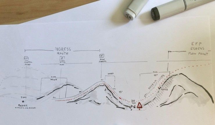
The first thing Joe said to me was, “nice use of Copics,” referencing the markers I had used for a few rough sketches of the final mission that I had done for our meetings. Joe was a designer-architect himself, so he really understands things like process and iterations. He was great to work with directly because he really got into the graphical part of the storytelling and was very supportive and enthusiastic with us.


Describe your favorite part or component of the project. How did it come together and how did you achieve it?
My favorite part was the daily conversations with Spock at Skunkworks, and with Dave “Schleprock” Biggs, my F-18 fighter jet subject matter expert. I’d ask things like, “Why are the F-18’s doing a flip at the top of the mountain?” and Dave would answer, “Oh, that’s the only way to keep your speed when you’re dramatically changing direction like that.” It’s the process of making the story simpler, and really clarifying the characters and their emotional journeys that, in my opinion, made the film a win. My favorite parts were the months of being involved in that.

What were some specific challenges you faced? How did you go about solving them?
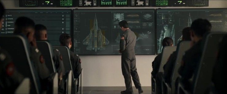
The entire production team was very behind making these sequences really flow well together for the audience. This was a great thing, but unfortunately also meant that the script rewrites were pretty intense at times. For instance, the scenes for the main Tactical-Auditorium training sequence where the pilots are learning to fly super low below radar, were being rewritten almost every three to four days. Each rewrite would be a healthy change to all of our designs and animations. The three different routes, colored red, green, and gold, that we originally had for the training is a good example of this. For a few weeks, I’d re-break down the new scripts to determine where each pilot was at each moment in time, as well as what new things were happening, whether it was breaching the height ceiling, losing electro-optical tracking, taking enemy missiles, etc. I'd then re-design and re-animate the entire sequences across all three big screens. There were a lot of late nights. But at the end of the day, asking the audience to follow the three routes simultaneously proved to be too distracting. For the final, they simply fly a single route. This kind of iteration is fairly typical in feature films, and is the reason I’ve always named my files with two leading zeros in the version numbers.


Was there any 3D work? If so, how did you accomplish it?
Yes. Originally, Kosinski wanted a very lo-fi, pure “2D” look for the screens. Nothing 3D, and definitely no holograms. But I did design the plane schematics of the F-18’s and the enemy SU-57 5th generation fighters for the “Who’s in the air” training screens. These were all done with Maxon Cinema 4D, imported directly into Element 3D inside After Effects. Dlew and I also did all the planning, modeling, animating and initial rigging for the look dev of the 3D training sequences.

What other software did you use on this project and why did you originally choose them?
As usual, I designed in Adobe Illustrator, with final animation in Adobe After Effects. This has been my personal go-to workflow for almost a decade. All of Adobe’s tools play so well together. This allows our team the quickest workflow from design, to animation, back to changes, and then to final composites.

What’s your hidden gem/favorite workflow tip in After Effects or Adobe Creative Cloud?
I really love the added speed and abilities I can get from a huge library of add-on scripts. Since what I do is a bit specialized, these allow me to create a bit of a bespoke program meant to quickly do exactly what I need it to do. Using Creative Cloud, I also love being able to build up custom libraries of colors, icons, and assets that our team can reference and share across all Adobe apps.
Who is your creative inspiration and why?
Leonardo DaVinci has been my favorite source of inspiration since childhood. He found a really beautiful way of blending the organic and the technical. I loved that when he drew something, you often saw the exterior AND the interior, which to me is what I love most about holograms. He also was one of the first artists to draw different views of the same object, with side, top, and perspective, which was the beginning of what we have in all 3D programs now, including After Effects.


What’s the toughest thing you’ve had to face in your career and how did you overcome it?
Hard work. Big clients. Big expectations. For the longest time, I was only seeking work that I already knew how to do, for clients that didn’t scare me. I realized quickly though, that I only grew with the scary, uncomfortable projects for demanding clients. These are the projects where you wonder if you can even do it. But in the end, those are the most fulfilling projects. So now, those are the only projects I like to take on. Do the work that excites you.
What advice do you have for people aspiring to get into FUI motion graphics in film or TV?
It’s a great time to get into this space. There is more work than people that can actually do it well. My best advice is to make friends with the people that are already doing what you want to do. For the most part, we’re all just super friendly. You can meet us at conventions, places where we are speaking, or simply through Instagram. It’s a rare super-niche space, so to us, finding people interested in this work is always great!
Share a photo of where you work. What’s your favorite thing about your workspace and why?

This is my home office while animating the Darkstar cockpit graphics. My favorite thing is probably that, after years of just working in a junk room, I finally took some time and made this one to be a small museum of my favorite movie props. On the far right is the original screen-used Ender’s Game tablet that I had designed and animated graphics for. In the back right corner is a life-sized Iron Man Mark 42, that I designed the HUDs and holograms for. And in the far left corner is a stunningly accurate 1:1 Ghostbusters Proton Pack, which I designed nothing on, but still love. There’s a calmness and appreciation of film design in this space. It’s a place that’s exciting to come into, and makes me eager to get to work jamming on the next film.
For more, check out Jayse Hansen’s work and join his newsletter.
Top Gun: Maverick is now available for purchase on streaming platforms, including YouTube, Vudu, Apple TV, Google Play, and Amazon Prime.
Your Comment