There are a lot of cliche jokes about the style of Wes Anderson's films, but if you want to investigate a deeper sense of what makes his movies unique, this video is for you.
We've all seen the easy gags ripping on Wes Anderson's style. "Stand people in the center of the frame" and "wear a funny outfit," and you are immediately in an Anderson movie. But this video by Thomas Flight does a deep dive into understanding certain aspects of the Anderson aesthetic and what artistic goals he is pursuing in using that aesthetic.
Watch the video, then jump into our discussion.
Wes Anderson Style Guide: Visuals and Storytelling
Framing
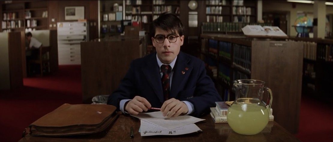
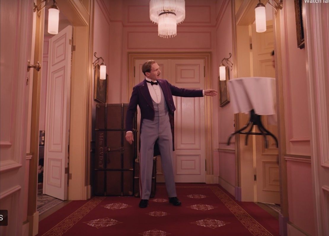
The video starts with a discussion of one particular aspect of Anderson's style, planar framing, where most frames are set up not shooting into a corner but against a flat wall.
These shots can still have depth to them (from a Z-axis move or converging lines), but the end of the world is present in the frame, a flat wall. The video talks about them being presentational, and they absolutely are presentational, but to me, they go beyond that.

Planar compositions are finite. They present a limited world. Even if there is depth in them, they stop at a certain point and go no further.
Shooting into a corner, with open doors and converging lines, points towards a bigger, infinite world. The planar, limited world feels more like the world we remember from childhood, where our universe was circumscribed and predictable, and the chaos of adulthood and infinity was removed from us.
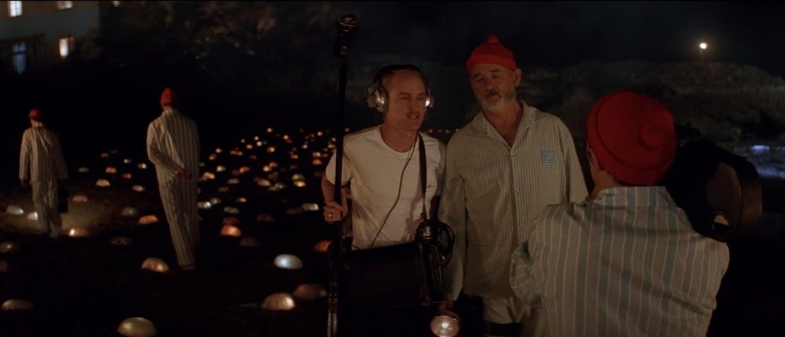
The video picks out this one feature of Anderson's filmmaking, but they could just have easily talked about the stylized production design and wardrobe, to hit on a core concept, which is that Anderson isn't trying to be natural and doesn't feel pressure to feel "real."
Anderson knows it's not real and doesn't care.

Style
This is where the video goes beyond the surface and starts talking about what is really interesting, which is the goals of a style.
Style isn't purposeless. It has a point—something it is delivering, something it is serving. For Anderson, it's part of an artistic project of using self-aware storytelling to serve emotional ends. To accept that you don't need artificial naturalism to have an emotional connection to characters or a movie.
For most of us, the first experience we have with storytelling is being told a tale by our parents when we are young. Typically that moment is one full of improvisation, exploration, and tremendous artificiality, even when reading a prewritten story. Not only are children's stories free to be non-naturalistic, parents reading them typically change and inflect the story a fresh way every time, and children seldom forget who is telling the story (their parent).
That sense of connection between the storyteller and the listener is ultimately what Anderson seems to be going for.

While movies about movies and cinema about storytelling can sometimes fall into solipsistic cliche (Community has a great episode about this), that isn't true of Anderson.
Looking at his films is a study of how storytelling connects people, and all the aesthetic tropes and cliches on the surface that people like to mimic are all in service of giving us that sensation of enjoying a well-told story that shows the hand of its creator.
What do you think of Anderson's storytelling and visual styles? Tell us in the comments!
Your Comment