No one utilizes space, be it literal or metaphorical, quite like Miyazaki.
Director Hayao Miyazaki is a master storyteller. Films like Spirited Away, Princess Mononoke, and Howl's Moving Castle not only capture our imaginations with their beautiful artistry and attention to detail, but they also capture our attention with their subtle intellectual, political, and spiritual challenges.
The combination of all of these elements, as well as the stunning cinematography and engaging storytelling, is what sets Miyazaki apart from other directors. Perhaps one of the most interesting ways he marries all of these aspects of filmmaking is in his use of both physical and metaphysical space, something that is explored at length in this insightful video essay by Adrian Randall.
Vertical space
To other filmmakers, the sky is just the sky, but to Miyazaki the sky is something much more. According to Randall, it's where things like imagination, possibility, and spirituality dwell, but it's also where many of his combat set pieces occur. The fight between good and evil takes place in most films, whether it's on a battlefield, a sports arena, or even inside a character's own mind, but for Miyazaki, he takes the battle to the very place that represents all that is good and right within his universe: the sky. This creates an interesting duality that is not only represented in the narrative, but in the visuals as well.
This is why many of his films, like Spirited Away and Princess Mononoke, utilize physical space in interesting ways. Using what we now know about what the sky represents in Miyazaki's work, it makes sense that these films often use vertical space as a visual indicator of the narrative progression of the story and character arch. Using the example from the video, as Ashitaka climbs higher up the landscape (a mountain, a watchtower) in Princess Mononoke, he is met with many forces who don't want to see him reach the top—his ultimate goal—the sky.

Cluttered space
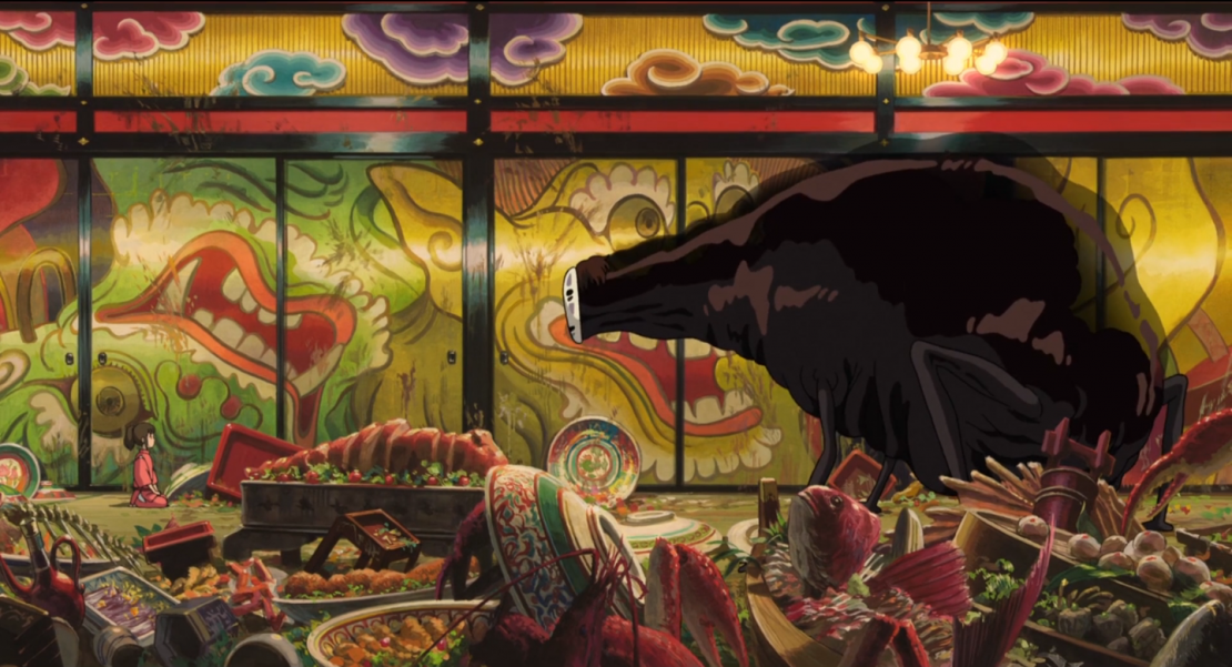
For Miyazaki, visually representing the realm of the metaphysical isn't limited to lines on a the x, y, and z axis. He also communicates this to his audience by adding visual elements to a space, or taking elements away from it. Spirited Away is a great example of this. When Chihiro finds peace, her surroundings are simple, clean, and tranquil, but when she is faced with challenges, they become crowded, filthy, and chaotic. This is why the scene in which she attempts to calm No Face in a room filled with graffiti, trash, and junk is so powerful, because we're forced to look at Miyazaki's duality: peace and chaos, good and evil, clean and unclean.
Hidden space
Though Miyazaki's films are known for their beautifully intricate landscapes and art design, the director knows when to deny his characters, and thus his audience, any solid information about the space they're in. We've seen this in Spirited Away with the labyrinth bathhouse, as well as in Howl's Moving Castle with the nonsensical architecture of Howl's (moving) castle.

Miyazaki is definitely worthy of plenty of study, whether it be his use of space, "ma," or the way he captures true humanity using an animated medium. I definitely suggest learning more about his approach to filmmaking, as well as films.
Your Comment
1 Comment
Great video, loved every second of it!
March 25, 2017 at 10:45PM